Visualize spatial data in maps using R and Python
For spatial data analysis, visualizing the spatial patterns of the data is necessary. In many cases, a map is used as the background of the figure. This post summarizes several commonly used methods to make maps with R and Python.
1. R
There have been many packages developed in R for plotting different maps. This post introduces the use of packages as follows which should meet the needs of most situations.
- “maps”: obtain map data, e.g., world map, country map, state map, etc.
- “mapdata”: extra map database that contains higher-resolution map data.
- “ggplot2”: a powerful tool for plotting various figures and can be conveniently used for map plotting.
- “ggmap”: an integrated package for obtaining map data, e.g., Google Maps, and plotting maps using the layered grammar of graphics implementation of “ggplot2”.
library(maps)
library(mapdata)
library(ggplot2)
library(ggmap)
1.1 Basic maps using “ggplot2”
If people just want to create a map without other information on it, the map can be made easily using ggplot2 package. This post gives three examples showing how the outline-maps are created as follows.
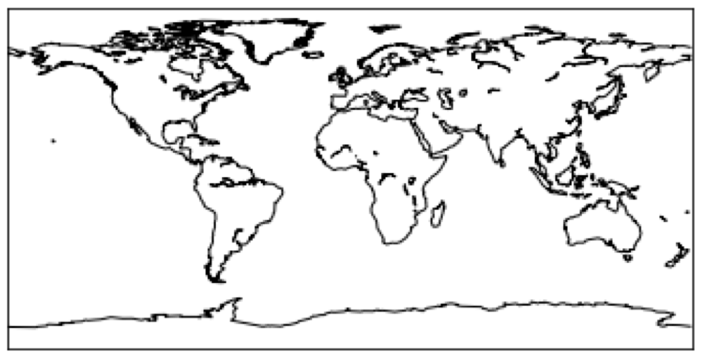
- World Map
world <- map_data("world") #obtain world map data
#plot world map
ggplot()+
 geom_polygon(data = world, aes(long, lat, group = group), fill = NA, color = "black")+
 coord_quickmap()+
 theme_nothing()
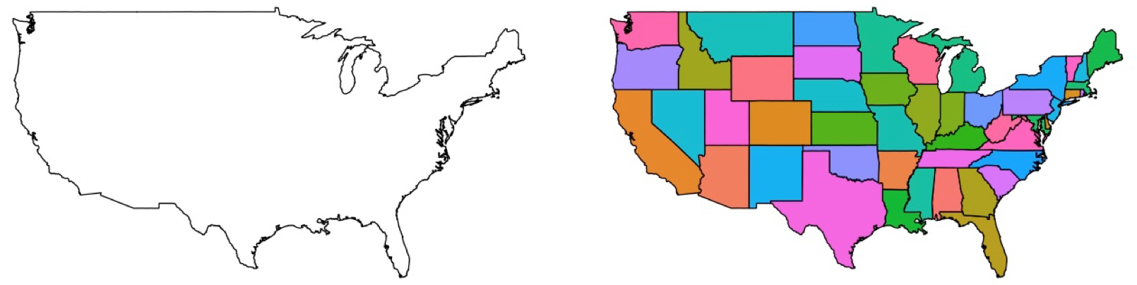
- USA map
usa_outline <- map_data("usa") #obtain the outlines map of usa
usa_states <- map_data("state") #obtain usa map containing states
#plot the outline usa
ggplot()+
 geom_polygon(data = usa_outline, aes(long, lat, group = group), fill = NA, color = "black")+
 coord_quickmap()+
 theme_nothing()
#plot usa map with states
ggplot()+
 geom_polygon(data = usa_states, aes(long, lat, group = group, fill = region), color = "black")+
 coord_quickmap()+
 theme_nothing()
- Florida Map
states <- map_data("state") #obtain states map of usa
fl_state <- subset(states, region == "florida") #select florida state from all the states
#plot florida state outline map
ggplot()+
 geom_polygon(data = fl_state, aes(long, lat, group = group), fill = NA, color = "black")+
 coord_quickmap()+
 theme_nothing()
#=========================================================
counties <- map_data("county") #obtain counties map of usa
fl_county <- subset(counties, region == "florida") #select florida's counties from all the counties
#plot county map of florida state
ggplot()+
 geom_polygon(data = fl_county, aes(long, lat, group = group, fill = subregion), color = "black")+
 coord_quickmap()+
 theme_nothing()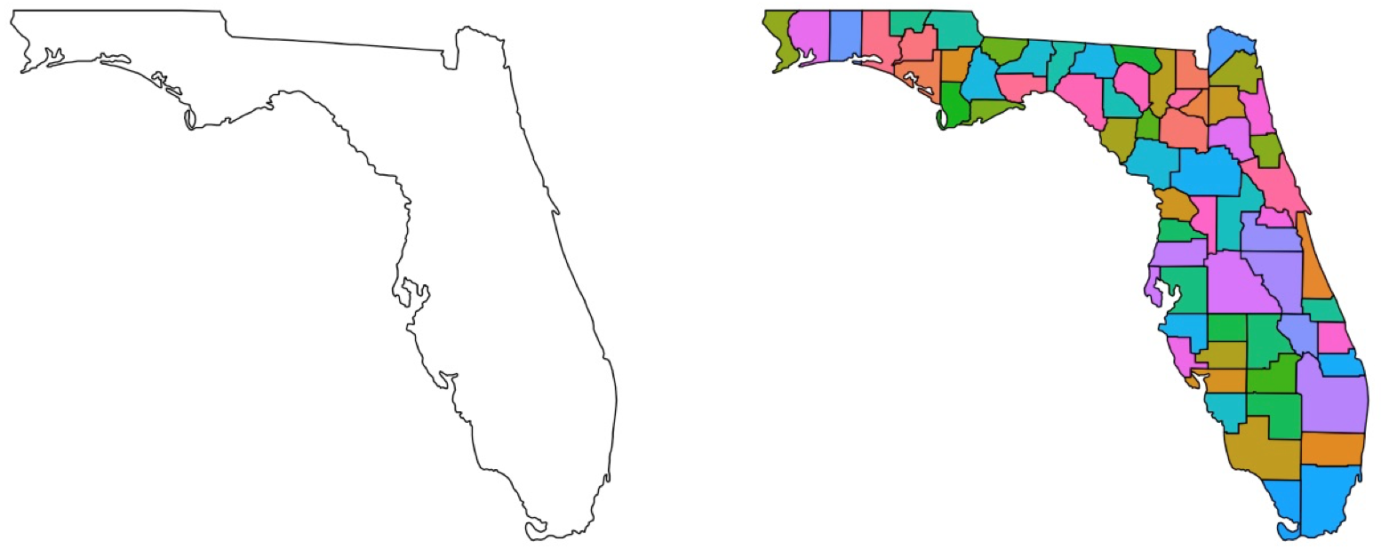
Comments:
-
map_datais a function used for obtaining the outline data of certain maps. The data usually contains:long,lat,group,order,region, andsubregionthat basically “define” a map. -
ggplotis the function that initiates the map plotting process for the subsequent layers. -
geom_polygonis the main function that plots these outline maps. People can customize the map by changingfill, andcolor, etc. -
coord_quickmapis used for projecting the spherical map data onto a 2D plane. It basically controls the aspect ratio of the map. There are also other functions can control the projection, e.g.,coord_map. -
theme_nothingis used for removing all the background theme (non-data display), e.g., axis, background color, etc. Other themes can be chosen viatheme_xxx, e.g.,theme_bw.
1.2 Maps with spatial information using “ggplot2”: three examples
- point data: load the commonly used “ozone” data, and plot it with its corresponding locations/map:
#==============point data==============
data(ozone)
states <- map_data("state") #obtain states map of usa
ggplot()+
  geom_polygon(data = states, aes(long, lat, group = group), fill = NA, color = "black")+
  geom_point(data = ozone, aes(x = x, y = y, size = median), color = "red")+
  coord_quickmap(xlim = range(ozone[,1]),  ylim = range(ozone[,2]))+ # zoom in on [xlim, ylim]
  theme_void()# empty theme with legend, theme_nothing() will strip legend as well.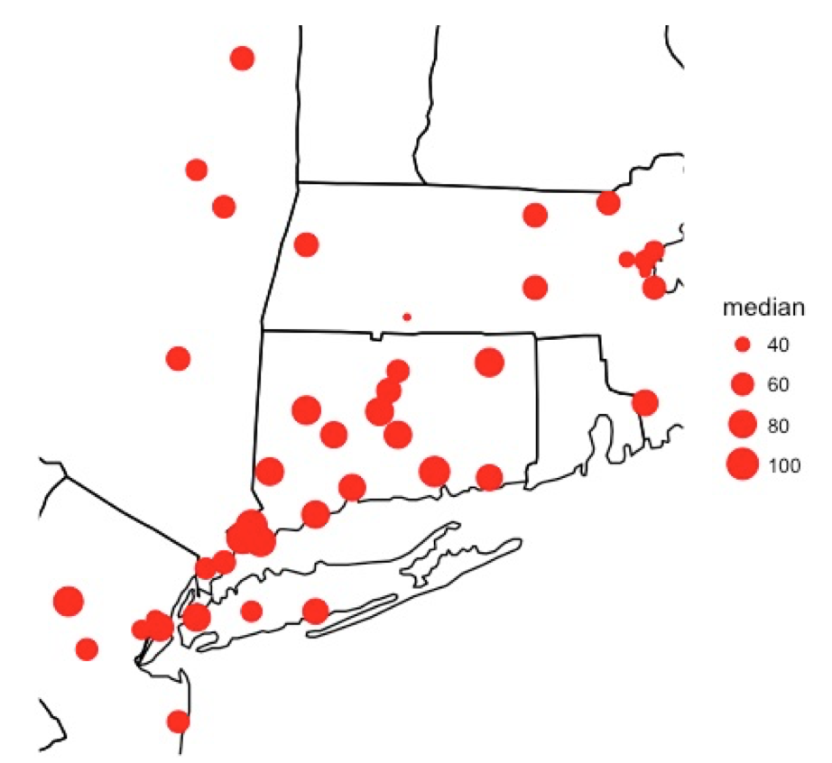
- areal data: download and plot the GDP data of all the U.S. states in 2016 from BEA(The Bureau of Economic Analysis of the U.S. Department of Commerce)(the downloaded GDP data “gdp.csv” used in the following code is available here with direct downloading link here):
#==============areal data===============
dat <- read.csv("gdp.csv", header = FALSE)
GDP2016 <- data.frame(tolower(as.character(dat$V2[7:65])), as.numeric(dat$V22[7:65]), stringsAsFactors=FALSE)
names(GDP2016) <- c("region","GDP")
GDPMap <- merge(GDP2016, states, by = "region")
ggplot()+
  geom_polygon(data = GDPMap, aes(long, lat, group = group, fill = GDP), color = "white")+
  #coord_quickmap()+
  coord_map("albers", parameters = c(45.5, 29.5))+
  theme_void()+scale_fill_gradientn(colours = cm.colors(7),
                                   breaks = c(20000, 40000, 100000, 500000, 1000000, 1500000),
                                   trans = "log")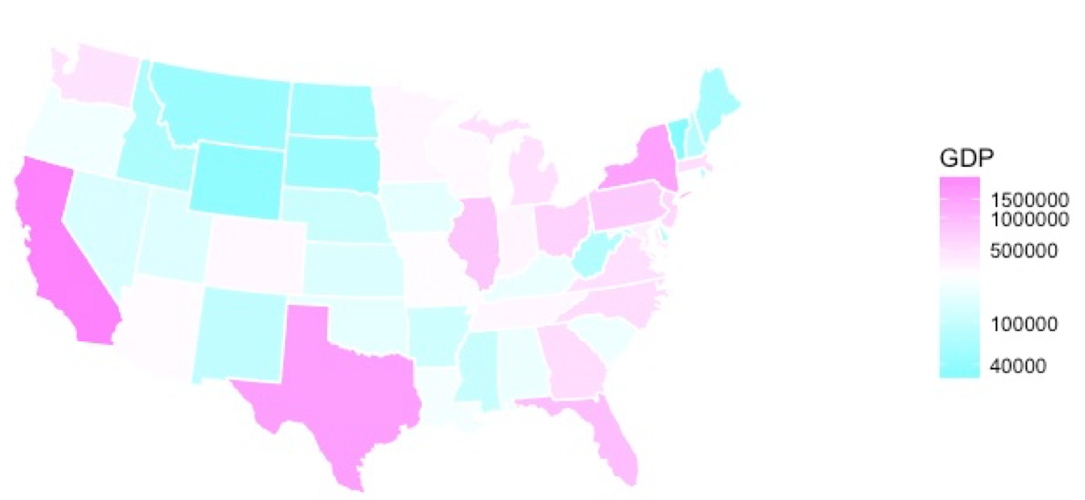
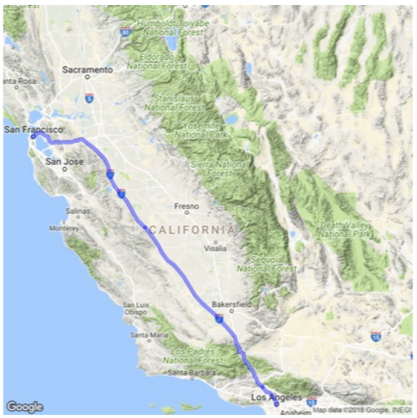
- path data: plot an navigation route from San Francisco to Los Angeles. The route data can be easily obtained from the “ggmap” package using function
trek:
#========obtain and plot path data using "ggmap"===============
trek_df <- trek("san francisco, california", "los angeles, california", structure = "route")
qmap("california", zoom = 7) +
  geom_path(
    aes(x = lon, y = lat),  colour = "blue",
    size = 1.5, alpha = .5,
    data = trek_df, lineend = "round"
  )
Comments:
theme_void()creates an empty theme with the legend on, andtheme_nothing()will strip the legend as well.- “ggmap” is a convenient package for retrieving map data from popular online mapping services, and plotting various types of maps under the “ggplot2” framework. Its GitHub repository is here.
2. Python
The most commonly used map plotting package in Python is “Basemap” from “Matplotlib”. Basemap needs to be additionally installed as it is not included in Matplotlib. The installation steps can be found in its GitHub page and documentation page. If you use “Anaconda”, installing Basemap is easy by using Anaconda’s Navigator GUI or simply using the command $ conda install basemap.
There have been many helpful tutorials about Basemap. Therefore, this post will not describe the use of Basemap in details. Instead, the following two links are two recommended tutorials:
Lastly, the shapefile of various maps can be freely downloaded from many websites, and then plotted using Basemap. A collection of websites for downloading shapefiles is summarized here. Additionally, an example of plotting a basic map using Basemap is:
from mpl_toolkits.basemap import Basemap
import matplotlib.pyplot as plt

map = Basemap()

map.drawcoastlines()

plt.show()